

Have you ever opened a photo in Lightroom and felt overwhelmed by all those sliders? You're not alone. Understanding how to visualize and adjust your exposure settings is one of the most crucial skills in digital photography — and it's easier than you think once you know what you're actually looking at.
Why Exposure Settings Matter
Before we dive into the technical aspects, let's talk about why this is worth the time to really learn. Your exposure settings are the foundation of every great photograph. They determine whether your image captures the mood you felt in that moment, whether details are preserved in the shadows and highlights, and whether your final image truly represents your artistic vision — or just what the camera guessed.
Think about the difference between a portrait where the highlights on a bride's dress glow with intention, versus one where they're simply clipped and empty. Or a golden hour landscape where the shadows still hold color and texture, versus one where the foreground has gone completely black. That difference isn't luck. It's craft. And most of it happens right here, in Lightroom's Develop module.

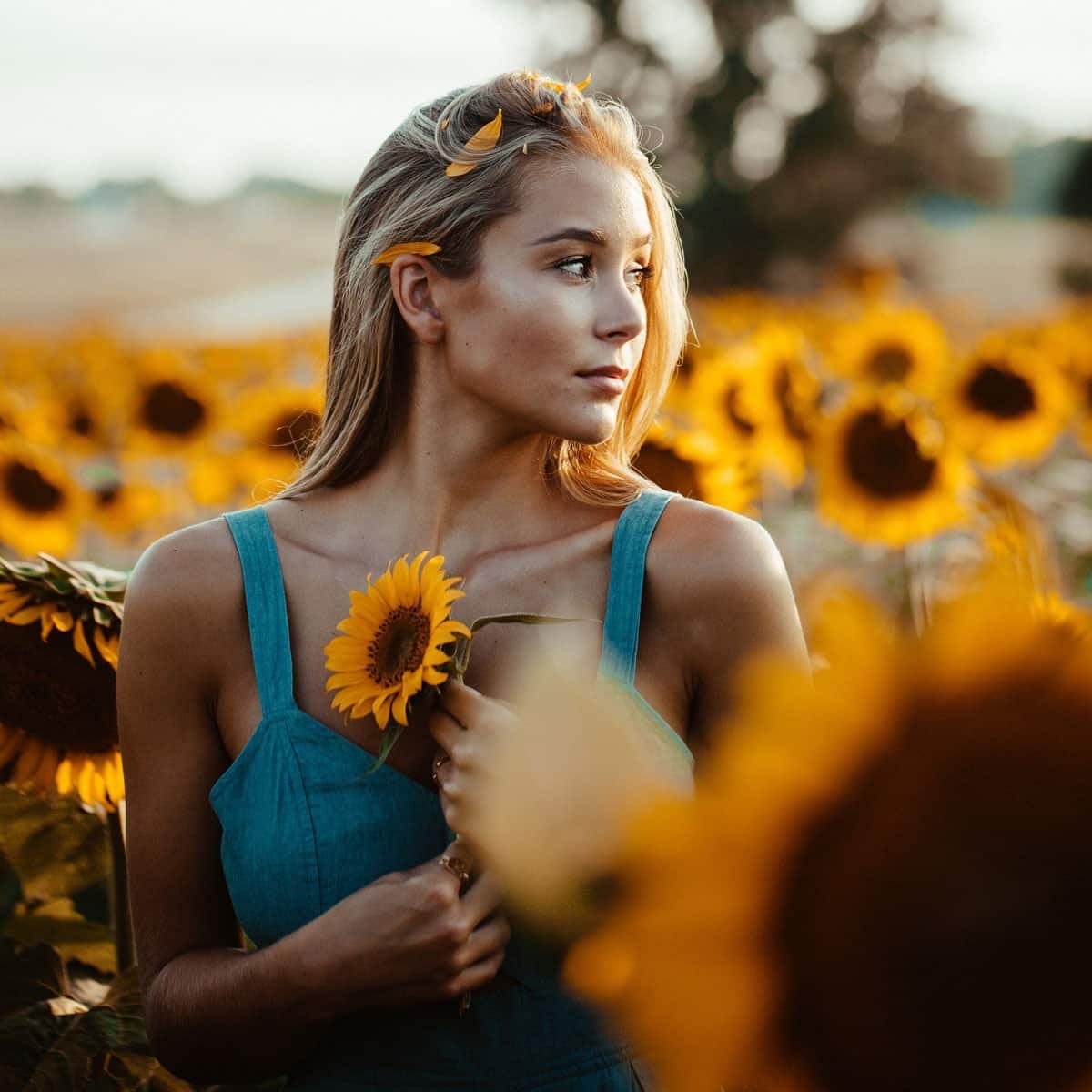
The second image is a classic in-camera overexposure scenario — the background blows out and the hair loses highlight detail. Lightroom's tools can address this decisively, as long as the RAW file captured enough recoverable data to begin with.
"Light is the great reveal. In camera you capture it. In Lightroom you interpret it. The best editors understand the difference."
Reading Your Histogram: Your Most Powerful Tool
The histogram in Lightroom CC is the single most useful tool in the Develop module — and the most overlooked by photographers at every level. It's not decorative. It's a precise, real-time map of every tonal value in your image, and once you learn to read it fluently, you'll never edit blind again.
The horizontal axis represents tonal values from pure black on the left edge to pure white on the right edge. The vertical axis shows how many pixels in your image have each tonal value — a tall spike means many pixels at that brightness level, a flat section means very few.
| Zone | What It Represents | Warning Sign |
|---|---|---|
| Left edge | Pure blacks — the darkest tones in your frame | Data piling against the left wall = lost shadow detail |
| Left quarter | Shadow tones — the darker mid-range | Cliff on the left with empty space = crushed blacks |
| Center | Midtones — skin, foliage, most of your subject | Very flat center often indicates low contrast |
| Right quarter | Highlight tones — the brighter mid-range | Empty right with a cliff = washed out areas |
| Right edge | Pure whites — the brightest tones | Data piling against the right wall = blown highlights |
The goal isn't always a perfectly centered, bell-curved histogram. A moody, low-key portrait is supposed to live mostly on the left. A bright, airy editorial image may be weighted toward the right. Your histogram reflects your creative intention — make sure it matches what you meant, not what the camera decided.
Turn on clipping indicators before you edit. Click the small triangles at the top-left and top-right corners of the histogram. The left triangle lights up blue when you're crushing shadow detail to pure black. The right turns red wherever highlights are completely blown. These warnings appear directly over your image — not just in the graph — making exposure decisions dramatically more intuitive.
The Six Exposure Sliders — What Each One Actually Does
Here's where most guides get vague. They tell you what each slider is called, but not how it behaves in practice or how to think about using them together. Let's be specific.
1. Exposure — Your Global Brightness Control
This is your master brightness lever. Moving it shifts the entire tonal range up or down — roughly equivalent to changing your aperture or ISO after the fact. It affects every pixel proportionally.
The key is resisting the urge to push it too far. A +2.0 Exposure will technically brighten the image, but it pushes your already-bright areas dangerously close to clipping. Use Exposure to place your midtones where they feel right, then use the other sliders to manage the extremes.
Set Exposure first to place your midtones. Then use Highlights and Shadows to handle the extremes. Never try to rescue a blown sky by pulling the main Exposure slider down — that darkens everything, including your well-exposed subject. Use the Highlights slider instead. It's precise where Exposure is blunt.
2. Highlights — Rescuing the Brightest Areas
The Highlights slider operates in the upper tonal range — roughly the top quarter of your histogram. Pulling it left reduces the brightness of your lightest tones without touching your midtones or shadows. It's your primary tool for recovering overexposed skies, bright windows, and blown background areas.
If you can see texture on a white dress in your original RAW file, the Highlights slider can bring it back. If it's already fully clipped — pure white pixels with zero data underneath — nothing will recover it. This is the single strongest argument for shooting RAW rather than JPEG. RAW files hold far more recoverable highlight detail than JPEG can ever preserve.
3. Shadows — Opening Up the Dark Areas
The Shadows slider raises (or lowers) the darker tones without significantly affecting midtones or brights. Pushing it right reveals hidden detail in dark zones — texture inside a dense forest, expression on a backlit face, color in a shadow that reads as flat black.
One important caution: lifting shadows aggressively on high-ISO images reveals noise. If you've shot in low light at ISO 3200 or above, opening the shadows will expose that grain. This is where Lightroom's Noise Reduction panel becomes your next stop before continuing.
4. Whites — Setting Your Brightest Point
The Whites slider sets the absolute brightest point in your image — it defines where "pure white" lives on your histogram. Unlike Highlights, which affects a broad range of bright tones, Whites is more surgical and operates at the very top of the tonal scale.
The technique: hold Alt (Option on Mac) while dragging Whites. Your preview goes black and colored areas appear as you push the slider right — that's exactly where you're beginning to clip. Push until you see minimal clipping on specular highlights only (a catch light in an eye, a metallic reflection), then back off slightly. That's your ideal Whites setting.
5. Blacks — Setting Your Darkest Point
Blacks works the same way but for the opposite end of the scale. The same Alt/Option technique applies: hold the key while dragging left and watch for the first colored areas to appear on the white preview — that tells you exactly when shadow detail is being crushed.
A deliberate black crush — intentionally pushing Blacks left so the shadows go fully dark — is a valid creative choice. It adds drama, contrast, and a film-like quality. The difference between a great edit and a muddied one is whether that choice was made intentionally.
6. Contrast — Use Last, Use Lightly
The Contrast slider is a blunt instrument compared to the others. It simultaneously brightens highlights and darkens shadows, spreading the tonal range apart. It adds punch to a flat image — but push it too far and you'll clip highlights and crush shadows you spent time rescuing.
Adjust Exposure, Highlights, Shadows, Whites, and Blacks first. Those five sliders together give you far more control than Contrast ever could. Then add a small amount — usually no more than +15 to +25 — for the final sense of dimensionality. Think of Contrast as seasoning, not the main ingredient.
White Balance and the Perception of Exposure
This is the section most exposure guides skip entirely, and it matters more than almost anything else on this page. Your white balance settings directly affect how bright or dark your image appears to the human eye — even when the actual luminosity values haven't changed.
A cool, blue-shifted white balance makes images look darker and moodier. A warm, amber-shifted white balance makes them appear brighter and more luminous. This is a quirk of human visual perception — our brains associate warm light with sunlight, and therefore with brightness, even when the exposure values are identical.
In practice: if you're editing a portrait and can't quite get the skin tones to feel glowing no matter how much you adjust the exposure sliders, try warming the Temperature slider by 200–400K. You'll often find that the image clicks into the luminous quality you were looking for — with no change to actual exposure at all.
Set white balance before you touch any exposure slider. Temperature shifts change how your midtones read — any exposure work done before correcting color may need to be re-evaluated afterward. Color first, then brightness. Always.
The Tint slider — the other half of white balance — shifts between green and magenta. Green casts make skin look sickly and reduce the perceived warmth of an image. A slight magenta push of +5 to +15 is flattering on skin tones and adds richness to shadows. These are subtle but they compound. They're often the difference between an image that feels right and one the viewer can't quite put their finger on.
Local Adjustments: Exposure Where You Need It
Everything covered so far applies globally — to every pixel in your image simultaneously. But the most powerful exposure work often happens locally. Lightroom's masking tools let you apply exposure corrections to specific areas without affecting anything else.
This is where good editing separates from great editing. A bright sky and a well-exposed subject almost never need identical treatment. A window in the background of a portrait requires something completely different from the subject's face. Local adjustments are how you honor that complexity.
The Graduated Filter
Drag a linear gradient across your image to apply a smooth, graduated exposure adjustment — identical in principle to a physical graduated ND filter on your lens. The most common use: pull down an overexposed sky while leaving the foreground untouched. Draw the gradient from the top of the frame down to the horizon, reduce Exposure and Highlights, and watch the sky come back to life without touching your subject.
The Radial Filter
The Radial Filter creates an oval or circular adjustment zone. Use it to brighten your subject in the center of the frame, darken the edges to create a natural vignette, or add a soft highlight glow around a specific area. The Feather slider controls how gradually the effect transitions — a high feather value (80–100) creates a blend so invisible it looks like the light was always that way.
The Masking Brush
The brush gives you the most precise control of all. Paint exposure adjustments exactly where you want them — brighten only the eyes in a portrait, darken a distracting bright element in the background, recover detail in a single blown window without touching anything around it. Used with a soft brush at reduced flow and density, it mirrors the traditional darkroom technique of dodging and burning. That tradition existed for exactly the same reason we use local adjustments today: because real scenes have real complexity.
Hidden inside every local adjustment is the Luminance Range Mask. It lets you tell Lightroom: "apply this adjustment only to pixels within a specific brightness range." For highlight recovery specifically, this is extraordinary — create a mask that affects only the very brightest areas, pull those down, and watch the rest of the image stay completely untouched. Access it by expanding the Mask panel inside any local adjustment tool.
Local exposure adjustments let you honor the complexity of a real scene. Your subject and background almost never need the same treatment — and the best edits guide the viewer's eye rather than treating every area equally.
Visualizing Balance: Training Your Eye
Technical fluency with the sliders gets you to competence. What takes you further — to the kind of editing that feels alive rather than processed — is learning to see what an image needs before you touch a single control. This is a practice, not a setting. It develops over time through deliberate attention.
- Assess before you touch anything. Open the image and sit with it for five seconds. What mood does it have? What mood should it have? Where is your eye drawn first? Where does it snag? Setting an intention before picking up a tool changes everything about how you use that tool.
- Use Before/After constantly. Press the backslash key to toggle between your current edit and the original. Do this every few minutes — not just at the end. It's the most reliable guard against over-editing, which is the single most common problem in digital post-processing.
- Scan the entire frame. Don't just look at your subject. Actively examine the corners, the edges, the background elements. Bright distractions in the periphery destroy composition. Shadow areas that could hold detail but don't feel like missed opportunities. Every part of the frame matters.
- Check on a second screen. If you only ever view your images on one monitor, you're editing in a bubble. Calibrate your monitor. Check edits on a phone, on a client's laptop, on a tablet. Each will show you something different, and together they'll teach you enormously about how your perceptions translate to other viewers.
- Control your ambient light. The light in your editing environment has a powerful effect on how you perceive your screen. Editing in a very dark room makes images look brighter than they are. Editing in a sun-flooded room makes them look darker. Consistent, controlled lighting in your workspace is more impactful than most photographers ever realize.
A Proven Exposure Workflow
Consistency in your editing process isn't about limiting creativity — it's about freeing it. When the sequence becomes automatic, you stop thinking about mechanics and start thinking about the image. Here's the order that works, and why each step belongs where it does.
The Technical Tools Are Just the Beginning
I want to leave you with something that took me a long time to genuinely understand: the sliders in Lightroom are not the destination. They're a vocabulary. And like any vocabulary, fluency only comes from using the words so often that you stop thinking about them — until what you're focused on is the story you're trying to tell, not the mechanics of telling it.
Every image you edit carefully teaches you something. You learn which slider does what under which conditions. You start recognizing problems before you check the histogram because you've seen them enough times. You develop an intuition for what a scene needs the moment it opens on your screen.
That fluency is what transforms post-processing from a chore into a creative extension of the moment you captured. The camera records light. Lightroom lets you interpret it. And interpretation — what you emphasize, what you quiet, where you guide the eye — that's where your voice as a photographer lives.
Start with the workflow above. Practice it consistently. And give yourself permission to make bold choices. The best images I've ever edited were the ones where I stopped asking "is this technically correct?" and started asking "does this feel true?"
Questions about Lightroom or exposure? Drop them in the comments below — every question is a good one, and the best learning usually starts with someone brave enough to ask.